

Gentrification is a much discussed topic in DC, along with many other American cities. The term describes a shift from a poorer neighborhood often populated with minority families to a wealthier neighborhood often populated with white singles and couples. Many District residents see the effects of gentrification around them daily, passing by the luxury shops in downtown or a construction site for a new high-end apartment building. What is to come for our neighborhood once The Wharf and the Capitol Riverfront are fully built out?
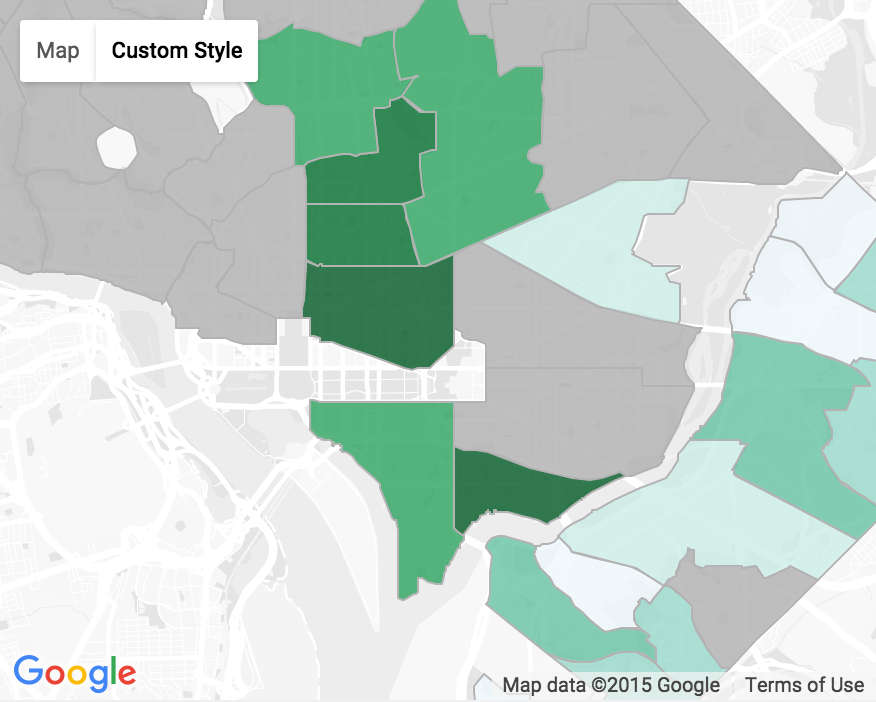
Let’s look at gentrification by the numbers over the past decade to better understand what these changes look like and where they are occurring. To do so we need to look at a couple key gentrification metrics—changes in income and proportion of African Americans—for neighborhood clusters that were below median income in 2000. The maps below show the change in two metrics over about a decade each for the selected neighborhoods.
(Note: Neighborhoods above median income are grayed out in the below maps. A darker green indicates greater gentrification-like change.)
Change in Income (%), 1999 to 2012

Source: American Community Survey, courtesy Neighborhood Info DC.
Changes in median income vary greatly across neighborhoods. Median family income in Southwest grew to just under $97,000, an increase of nearly 50% from 1999 to 2012. The Near Southeast/Navy Yard area experienced an astounding 147% growth from 1999 to 2012, in part because the poorer neighbor to Southwest was playing catch up. Median income there grew from just under $38,000 to more than $93,000.
Change in Proportion of African Americans (%), 2000 to 2010
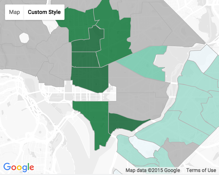
Source: Census, courtesy Neighborhood Info DC.
It’s been widely reported that the District is no longer the “Chocolate City.” No neighborhood cluster saw an increase in the proportion of African Americans over the decade. This is unsurprising east of the Anacostia where neighborhoods are upward of 97% African American, and largely stayed at that level. West of the Anacostia was a different story, with neighborhoods like Navy Yard, which experienced a 48% decrease in proportion of African Americans, and Southwest, which saw the proportion of African Americans fall by 28%. If the two maps look nearly identical that’s because the correlation between the two is -0.92, which is to say median income growth has a strong and negative relationship with the proportion of African Americans for the neighborhoods shown. Since these neighborhoods saw a rise in population, a decrease in the proportion of African Americans does not mean that that many African Americans have left those neighborhoods, but does speak to the changing racial landscape.
By: Kate Rabinowitz, Founder of DataLensDC
More about DataLensDC: Using open-source data and applications, DataLensDC presents readers with insight into the District’s character, trends, and hacks. The website was founded in the summer of 2015 by Kate Rabinowitz, lover of all things data and District. For more information, see DataLensDC.com.